Sarah grabbed her pliers and eyed the jumble on her table. Copper strips, silver leaves, and brass charms sat there. Her latest mixed-media project, a canvas blending fabric scraps and wood veneer, felt off. She swapped the silver for brass. Suddenly, the piece glowed with warmth. Mixed-media art mixes stuff like paper, fabric, wood, and metals into one-of-a-kind works. The trick? Pick metals that complement each other and the base.
You know the frustration. Metals clash, and your art looks messy. This guide breaks it down. You’ll learn metal qualities, smart pairings, testing steps, and real examples. By the end, you’ll mix metals with confidence for cohesive, standout pieces.
Grasp the Core Qualities That Make Metals Work Together
Metals bring shine and strength to mixed-media art. They also demand attention. Focus on key traits first. Color tones matter most. Warm ones like copper feel inviting. Cool ones like silver stay crisp. Shine levels vary too. Polished metals reflect light. Matte ones absorb it. Durability counts because art lasts. Patina develops over time on some, adding depth.
Ignore these, and your piece turns busy. Balance creates harmony. For example, pair a shiny accent with matte bases. This keeps eyes moving.
Here’s a quick comparison of popular metals:
| Metal | Tone | Common Finishes | Patina Potential | Durability |
|---|---|---|---|---|
| Gold | Warm | Polished, matte | Low | High |
| Silver | Cool | Brushed, oxidized | High | Medium |
| Copper | Warm | Hammered, patined | High | Medium |
| Brass | Warm | Antique, polished | Medium | High |
| Bronze | Warm | Aged, smooth | High | High |
This table shows options at a glance. Use it to spot matches. Notice how warm tones dominate. They pair well in most pieces. Cool ones add contrast. The takeaway? Mix one warm with one cool for balance.
For more on metal finishes, check Artists Network’s guide to metals in art.
Color Harmony: Warm vs Cool Tones
Warm metals include gold, copper, and brass. They pull from reds and yellows. Cool metals cover silver, pewter, and steel. Blues and grays define them.
Stick to similar tones for calm. Gold next to brass feels unified. Contrast them for energy. Copper beside silver sparks interest. Picture copper wires with red glass beads. It pops. Silver threads on blue fabric soothes.
Too many colors overwhelm. Limit to two tones. Test in natural light. Warms cozy up wood. Cools suit glass.
Texture and Finish Matches
Texture adds life. Hammered copper feels rugged. Smooth silver gleams sleek.
Match rough textures to fabric. It grounds the metal. Pair polished finishes with glass. Reflections dance. Oxidized pewter blends with stone.
Always test samples. Lay them on your base. Adjust as needed. Finishes evolve, so plan ahead.
Pair Metals with Your Base Materials for Seamless Blends
Base materials set the stage. Metals must fit. Consider visual weight. Heavy copper suits thick wood. Light foil works on paper.
Themes guide choices. Rustic calls for aged brass. Modern favors sleek steel. Size and lighting play roles. Small pieces need subtle shines. Big ones handle bold contrasts.
Pro tip: Layer metals. Base layer matte, top shiny. This builds depth.
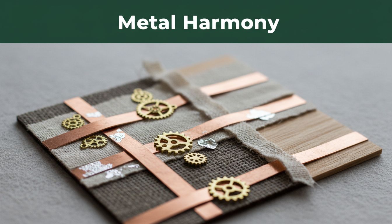
Metals That Shine with Wood and Fabric
Wood and fabric love organic metals. Brass rivets secure denim layers. They age together gracefully.
Aged bronze accents oak panels. Patina matches wood grain. Both feel earthy.
Try this beginner project. Glue copper strips to burlap. Add brass findings. Hang it as wall art. Natural textures unite them.
Glass, Resin, and Stone Pairings That Wow
Silver edges frame resin pours. It gives a clean, modern edge.
Gold flecks in glass create luxury. Stone slabs pair with bronze inlays. They share subtle warmth.
Embed carefully. Heat resin slowly to avoid cracks. Buff metals smooth first.
Paper and Canvas Combos That Last
Foil stamping jazzes paper collages. Gold or silver stamps hold crisp lines.
Lightweight aluminum sheets attach to canvas. They won’t sag.
Use acrylic glues for hold. Seal with varnish. This stops tarnish. Pieces stay fresh years later.
See adhesion tips at Dick Blick’s metalworking resources.
Simple Steps to Pick and Test Your Metal Mixes
Start with a plan. Follow these steps to nail combinations.
First, define your theme. Rustic? Sleek? Mood sets the tone.
Next, list base materials. Wood needs warms. Glass takes cools.
Then, sample two or three metals per tone. Buy sheets or scraps.
Mock up a small test piece. Glue or wire them in place.
Finally, view under real lighting. Daylight shifts tones. Adjust.
Experiment builds skill. You’ll spot winners fast.
Avoid These Common Metal Mismatches
Watch for pitfalls. Don’t use more than three metals. It crowds the eye.
Scale matters. Tiny silver on huge wood disappears.
Adhesion fails without prep. Clean surfaces first.
One artist fixed a flop. Her all-shiny brass overwhelmed fabric. She dulled half. Balance restored. Keep it fun. Mistakes teach.
Inspiring Examples from Real Artists
Real work sparks ideas. Take steampunk creator Lauren Picciotti. She layers copper gears on wood bases. Brass pipes add grit. The patinas blend seamlessly. Check her portfolio at Lauren Picciotti’s site.
Minimalist artist Jane Dodd uses silver wire on acrylic pours. Cool tones contrast resin swirls. It feels fresh and airy.
Then there’s mixed-media pro Seth Gould. Bronze castings meet fabric wraps. Warmth grounds the textiles. His pieces sell out fast. View examples on Seth Gould’s gallery.
What’s your favorite combo? Share in the comments. These pros prove testing pays off.
For more inspiration, explore Mixed Media Art’s metal combo gallery.
Ready to Mix Metals Like a Pro?
Tones, textures, and tests form the foundation. Pair warms with wood. Cools with glass. Always mock up first.
Grab scraps today. Build a small tester. Watch your art transform.
What’s your go-to metal pair? Comment below. Subscribe for advanced tips on patinas next. Endless combos await. Your next piece could shine.
(Word count: 1,482)