Picture Sarah rushing to get ready for her best friend’s dinner party. She grabs her cherished ruby necklace, slips on a navy blue dress, and steps back to check the mirror. The gems look dull against the fabric; the colors clash badly, and she panics, swapping outfits until time runs out.
Frustrating, right? That happens to so many of us when pairing jewelry with clothes. But here’s the fix: the color wheel for jewelry solves it instantly. This simple tool maps out color relationships, so you create stunning gem-metal-outfit combos without the guesswork.
You’ll pick gems that glow and metals that shine perfectly every time. No more mismatched stacks or buyer’s remorse.
In this guide, we cover the wheel’s basics first, so you understand its layout quickly. Then, we break down key color types like primaries, secondaries, and tertiaries. After that, explore harmony schemes such as complementary pairs or analogous groups, tailored for jewelry.
You’ll also grab practical tips for everyday styling and shopping smarter. Plus, learn mistakes beginners often make, and how to skip them entirely.
As a result, you shop with total confidence. Friends envy your envy-worthy stacks that always wow.
Ready to turn confusion into color magic? Let’s dive into the color wheel’s core right now.
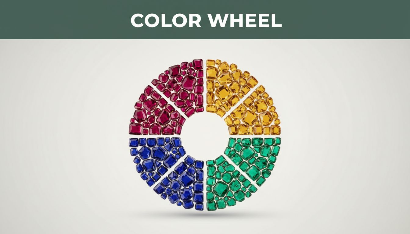
What Is the Color Wheel and Why It Transforms Your Jewelry Choices
Understanding the color wheel starts with its simple shape: a circle of 12 hues. Isaac Newton created the first version from his light experiments in the 1700s. Artists like Johannes Itten refined it later for better mixing. Picture it clockwise from red through orange, yellow, green, blue, and violet back to red. Primaries sit at even spots every four colors.
This tool brings color theory for jewelry to life. It shows how shades relate, so you avoid clashes. For example, pair a blue topaz necklace with orange accents; they pop because opposites attract on the wheel. You match gems like sapphires and emeralds easily. Gold’s warm yellow complements skin tones, while silver’s cool blue-gray fits others. Clothes coordinate too; a red ruby shines against green dresses.
Why does this change your choices? Colors next to each other blend smoothly. Those across fight for attention in a good way. You build outfits that flatter. Beginners grab random pieces that dull out. Experts use the wheel for bold stacks. In short, it turns guesswork into smart picks. Your jewelry glows every time.
Take Sarah from our story. She swaps her ruby for a sapphire next to navy. It works because blue sits opposite warm tones. Results? Confidence soars.
Primary Colors: The Building Blocks Every Jeweler Knows
Primary colors form the base: red, yellow, and blue. You can’t mix them from others. They stand pure and strong.
Red brings passion. Think ruby or garnet rings. They heat up cool skin tones. A bold red pendant grabs eyes on a black dress.
Yellow adds warmth. Citrine earrings light up faces. Yellow gold metals echo this glow. Pair it solo with neutrals for sunny vibes.
Blue offers calm. Sapphire or tanzanite necklaces soothe. They shine against warm outfits. Silver metals match blue’s cool side.
Jeweler pros start here. One primary dominates a piece. For instance, a yellow gold chain with a single citrine drop. Simple, yet striking. No mixes needed. These colors anchor designs. They set the mood fast.
You see them pure in nature too. Reds from iron oxides, yellows from sulfur. Blues from copper. Gems capture that essence. Go bold with one primary. Your stack tells a clear story.
Secondary and Tertiary Colors: Mixing for More Options
Secondaries come from primaries. Orange blends red and yellow. Green mixes yellow and blue. Purple joins blue and red. They sit between primaries on the wheel.
Tertiaries fill gaps. Red-orange leans fiery. Yellow-green feels fresh. Positions show harmony. Close colors blend; far ones contrast.
In jewelry, peridot gems give green life. Pair it with yellow gold for analogous calm. Amethyst purple adds mystery. Try it with silver for cool depth. Fire opal orange sparks energy. It pops next to blue sapphire.
Multi-stone pieces shine here. A ring with peridot, citrine, and emerald uses yellow-green ties. Or purple amethyst beside red garnet for secondary punch. The wheel guides balances.
Examples help. Stack an orange opal bracelet with blue topaz studs. Opposites vibrate. For subtle looks, choose adjacent green peridot and yellow citrine. Metals matter too. Rose gold boosts red-oranges.
These mixes expand choices. You create custom vibes. Secondaries warm primaries. Tertiaries add nuance. Always check wheel spots first. Your jewelry feels pro-level.
Master Color Schemes That Make Jewelry Sparkle
Color schemes take the color wheel and turn it into your secret weapon for jewelry. They group hues based on their spots on the circle, so you build pieces with purpose. Complementary schemes grab eyes with bold pops. Analogous ones flow like a gentle wave. Triadic brings balance without chaos. Monochromatic keeps things sleek and classy.
You pick these for specific looks. Want drama in a necklace? Go complementary. Everyday rings need calm? Try analogous. The wheel shows it all: opposites sit across from each other. Neighbors hug close. Evenly spaced triads spread out. One hue and its shades stay tight.
For jewelry, schemes match gems to metals and outfits. A complementary color scheme pairs blue sapphire with orange fire opal; they fight for focus in the best way. Balance comes from equal parts, or let one dominate. Contrast makes gems sparkle brighter against skin or fabric.
Analogous schemes use three to five side-by-side colors, like yellow citrine next to green peridot and blue-green aquamarine. They create smooth transitions, perfect for stackable bracelets. Flow feels natural, almost like nature’s palette. You wear them daily because they blend with most clothes.
Triadic schemes space colors evenly, such as red ruby, yellow topaz, and blue sapphire. Vibrant yet stable, they suit statement earrings. Each hue pulls its weight. Monochromatic schemes stick to one color family, say soft lavender amethyst to deep purple tanzanite. Elegance shines through layers of light and dark. Add texture with metals: gold warms yellows, silver cools blues.
Benefits stack up fast. Necklaces gain depth with these combos. Rings stay versatile for any hand. Earrings frame faces without overwhelming. Check the wheel first; it prevents dull matches. Gold works with warm schemes like oranges and yellows. Silver pairs best with cools like blues and greens.
Picture your collection transformed. A triadic ring set transitions from day to night. Monochromatic stacks elongate necks. You shop smarter too. Spot a gem? See its wheel neighbors for future buys. Schemes build outfits that last. In short, they make every piece pop with intention.
Complementary Colors for High-Impact Drama
Complementary colors sit directly opposite each other on the color wheel. Blue faces orange. Red meets green. Yellow clashes with purple. This max contrast creates fire.
Gems love it. Pair turquoise beads with coral accents for a beachy punch. Or emerald green with ruby red; they vibrate next to each other. The eye jumps between them, so your piece demands attention.
Why does it work so well? Opposites boost saturation. A blue topaz ring with burnt orange enamel glows. Light bounces sharper. However, use them sparingly. One focal gem in the main hue, accents in the complement. Too much, and it overwhelms.
Jewelry tip: metals bridge the gap. Gold tempers cool blues with orange. Silver sharpens warm reds against green. Try a necklace: central sapphire pendant, tiny orange garnet spacers. It suits evening wear, especially black outfits.
Stack earrings too. One blue aquamarine stud, one coral drop. Drama without bulk. Beginners often overload; pros pick one strong pair. As a result, your jewelry stands out. Friends notice the spark first.
Real gems shine here. Tanzanite blue pops against citrine orange. Tourmaline in both hues mixes naturally. Always test on skin. Cool tones handle blue-orange best. Warm skins favor red-green. You control the impact.
Analogous Colors for Smooth, Harmonious Vibes
Analogous colors cluster three to five spots together on the wheel. Yellow leads to yellow-green, green, blue-green. No big jumps. They blend like old friends.
Examples abound in gems. Stack citrine, peridot, and emerald for an earthy bracelet. Yellow fades into greens smoothly. Or try aquamarine, blue topaz, and iolite; cool waves for necklaces. Everyday pieces thrive here.
Great for subtle looks. These schemes suit office stacks or casual outings. Harmony comes from shared undertones. Yellows warm greens without shouting. You mix metals freely: rose gold adds blush to yellow-greens.
How to apply them? Start with a base gem. Build around its neighbors. A peridot ring with citrine side stones feels fresh. Add green aventurine for depth. Outfits match easy; pair with earth tones.
Vary shades for interest. Light citrine beside dark emerald prevents flatness. Bracelets shine: analogous beads on leather cords. They drape soft. In contrast to complements, these calm the eye.
You wear them often because they flatter most skins. Pale tones love soft yellow-greens. Deeper skins handle richer greens. Tip: limit to four hues max. Too many muddies the flow. Your daily jewelry feels polished.
Triadic and Monochromatic Schemes for Versatility
Triadic schemes space three colors evenly around the wheel. Red ruby at 12 o’clock, yellow topaz at 4, blue sapphire at 8. Balance rules. Each hue stands equal, yet they harmonize.
Vibrant pieces emerge. A triadic necklace mixes those primaries for punch. Or earrings: ruby studs, citrine hoops, sapphire drops. Energy flows without clash. Use for versatile looks; swap with neutrals anytime.
Jewelry pros love triads for multi-stone rings. Topaz centers it, ruby and sapphire flanks. Gold unifies warms. Silver highlights cools. When to choose? Bold events or transitional wardrobes. They adapt fast.
Monochromatic schemes simplify: one color, many shades. All blues from powder aquamarine to navy sapphire. Elegance builds in layers. Light tones lift; darks ground.
Apply to stacks. Blue topaz bracelet with tanzanite clasp. Add iolite beads for texture. Perfect for minimalists. Metals enhance: white gold for icy blues, yellow for sky tones.
Versatility shines. Monochromatics pair with any outfit; just shift shades. Triadics energize basics. Tip: 60-30-10 rule. One hue dominates 60%, second 30%, accent 10%. Prevents overload.
Examples help. Monochromatic amethyst set: pale to deep purple. Timeless. Triadic opal trio: fiery red-orange, yellow, blue-green. Playful yet pro. You mix and match endlessly. These schemes fit every style.
Hands-On Tips to Use the Color Wheel for Your Jewelry
You grasp the color wheel now. Time to apply it. Print a basic wheel or download an app like Adobe Color. First, spot your skin tone and outfit colors. Then pick gems and metals that match. These steps make your jewelry pop every day. In addition, consider seasons: summer calls for pastel analogous schemes, winter bold complements.
Matching Gems to Your Skin Tone and Wardrobe
Check your skin first. Warm tones show golden undertones; veins look green. Cool tones have pink or blue hints; veins appear blue. This guides your picks.
For warm skin, choose earth tones and oranges. Citrine or fire opal glows against golden complexions. Pair them with yellow gold. You look radiant because these hues echo your natural warmth.
Cool skin suits silvers and blues. Sapphire or aquamarine flatters pink undertones. Platinum metals enhance the cool vibe. As a result, gems shine brighter.
Match outfits next. Analogous colors stay safe. A green dress pairs with yellow-green peridot earrings. They blend smooth.
Want pop? Go complementary. Navy top with orange garnet necklace. The contrast grabs eyes. However, keep accents small.
Real examples help. Sarah’s warm skin loves a citrine bracelet on her beige blouse (analogous yellow-beige). For her cool-toned friend, blue topaz studs top a pink skirt (complementary blue-pink). Test pieces in natural light. Your confidence grows fast.
Here are quick tips:
- Warm skin: oranges, reds, yellows from wheel’s warm side.
- Cool skin: blues, purples, greens from cool side.
- Outfits: scan wheel for neighbors (safe) or opposites (bold).
- Seasons: summer pastels like soft blues and greens; winter ruby-red against evergreens.
Gemstone and Metal Pairings That Never Fail
Gold loves yellow and orange gems. Topaz or amber in yellow gold rings sparkles. The metal’s warmth boosts the stones. You create sunny stacks.
Silver or platinum fits blues and purples. Amethyst necklace in sterling silver calms. Tanzanite with platinum earrings adds depth. Cool tones harmonize perfect.
Mixed metals work with neutrals. Rose gold, yellow gold, and silver frame pearl or moonstone. Neutrals sit neutral on the wheel. They bridge warms and cools.
Avoid overload. Pick one dominant metal. Gold base with silver accents, for example. Too many shifts the eye.
Practical picks:
- Gold + citrine or carnelian for fall outfits.
- Silver + iolite or lapis for spring blues.
- Mixed + opals (neutral fire) for year-round versatility.
Apps like Coolors scan your photo for wheel matches. Start simple. Your pairs last seasons. Friends ask your secrets.
Avoid These Color Clashes in Your Jewelry Collection
Even with the color wheel in hand, clashes sneak in. You grab gems that look great alone but fight together. Common slip-ups include overloading on complements, skipping skin tone checks, and blending tertiaries into mud. These kill sparkle fast. However, the wheel fixes them. Limit to three or four colors. Test combos on paper first. Your collection shines as a result.
Overloading on Complementary Pairs
You love the drama of opposites, so you pile on blue sapphire, orange citrine, and extra accents. Chaos hits. Colors compete too hard; nothing stands out.
Picture a necklace: chunky blue topaz pendant plus orange garnet beads and a red ruby clasp. It screams overload. The eye bounces everywhere.
Fix it with the wheel. Pick one main complement pair. Blue topaz center, subtle orange spacers only. Before, it dulled. After, sapphire pops clean against the hint of orange. Gold ties them warm. Now it grabs attention right.
Limit accents to 10% of the design. You control the fire without burnout.
Skipping Skin and Outfit Matches
Warm skin meets cool blue amethyst stack. Gems wash out flat. Or a green emerald necklace on bright pink dress; they jar.
Before example: golden-toned arm with icy silver iolite bracelet. Looks drained. Switch to citrine in yellow gold. Warmth matches; it glows.
Cool skins avoid heavy reds. Test against veins. Green veins mean warm; pick yellow-greens like peridot. Blue veins call for silvers and purples.
Outfits too. Wheel neighbors blend safe. Navy shirt plus orange opal? Skip it. Go analogous blue-green aquamarine instead. Confidence builds when pieces flatter natural tones.
Muddy Tertiary Blends
Tertiaries like red-orange and yellow-green tempt mixes. Add too many, and hues blur into brown-gray sludge. No vibrancy left.
See a ring: fire opal (red-orange), citrine (yellow), peridot (yellow-green), plus emerald. It muddies fast.
Wheel solution: cap at three close tertiaries. Fire opal with soft yellow-green only. Before, flat mess. After, fresh pop. Silver sharpens the edges.
Vary shades too. Light citrine lifts dark peridot. You dodge dullness every time.
Spot these clashes early. Your jewelry tells a sharp story. Friends compliment the glow.
Conclusion
You now hold the key to stunning jewelry looks. The color wheel basics, smart schemes, and quick tips turn clashes into glows. Sarah’s panic ends; your stacks shine every time.
Grab a color wheel today. Pick one scheme, like analogous for calm vibes, and test it this week. As a result, your outfits level up fast.
Share your results in the comments below. What gem combo wowed you most? Subscribe for more guides like this. Download our free color wheel printable too.
Your personal style waits. Mix with confidence; let colors tell your story.